Case study · Computational fluid dynamics & self-directed research
Why the Wind Dies at This Kiteboarding Spot
Solo graduate project: a full pipeline from USGS lidar terrain data to a Fortran large-eddy simulation, quantifying the dead zones and gust-prone regions I have felt firsthand kiteboarding at a specific spot on Whidbey Island.
The problem
I kiteboard at a spot on Whidbey Island, Washington, and like every rider there, I’ve felt the wind mysteriously die in certain patches near the shore while staying strong just yards away. For a graduate turbulence course (ENMEE6370, Turbulence Theory & Modeling), I turned that personal, qualitative experience into a research question: does the terrain around the site actually explain the dead zones, and can a simulation find them without ever setting foot on the water?
The goal wasn’t just to produce a pretty flow-field visualization — it was to build an end-to-end workflow connecting real public terrain data to a physically interpretable answer about where the wind gets weak and where it gets gusty.
Approach
I defined a geographic bounding box around the site and pulled USGS lidar elevation data, which spanned five separate USGS data tiles that had to be cut and spliced into one continuous surface. I built that terrain-processing pipeline in Julia using PointClouds.jl, converting the raw elevation data into STL surfaces at multiple resolutions to see which terrain features survived at each level of detail. The LES solver couldn’t consume the STL surface directly — it needed a terrain representation in a different format — so the final step converted the processed terrain into a CBD file the solver could read as its lower boundary.
Simulation setup LES solver configuration, grid, wind forcing
The simulation domain was about 5,376 m × 10,372 m × 800 m, resolved on a 256 × 512 × 129 grid (roughly 21 m × 20 m horizontal spacing), run with a Fortran-based large-eddy simulation solver using a static Smagorinsky subgrid-scale model and an immersed-boundary representation of the terrain. The domain used periodic lateral boundary conditions, so I kept the analysis focused near the center of the domain, away from the edges where that periodicity introduces artifacts.
Wind forcing combined x- and y-direction body forces to represent an angled, roughly 15° southwesterly wind, calibrated using the logarithmic wind-profile relationship to produce an average velocity near 10 m/s over open water. The simulation ran 120,000 iterations at a 0.1 s time step — about 12,000 s of simulated time, roughly eight full flow-through times — starting from a logarithmic wall-law velocity profile and using the later portion of the run, after the flow had time to develop real turbulent structure, for the actual analysis.
Results
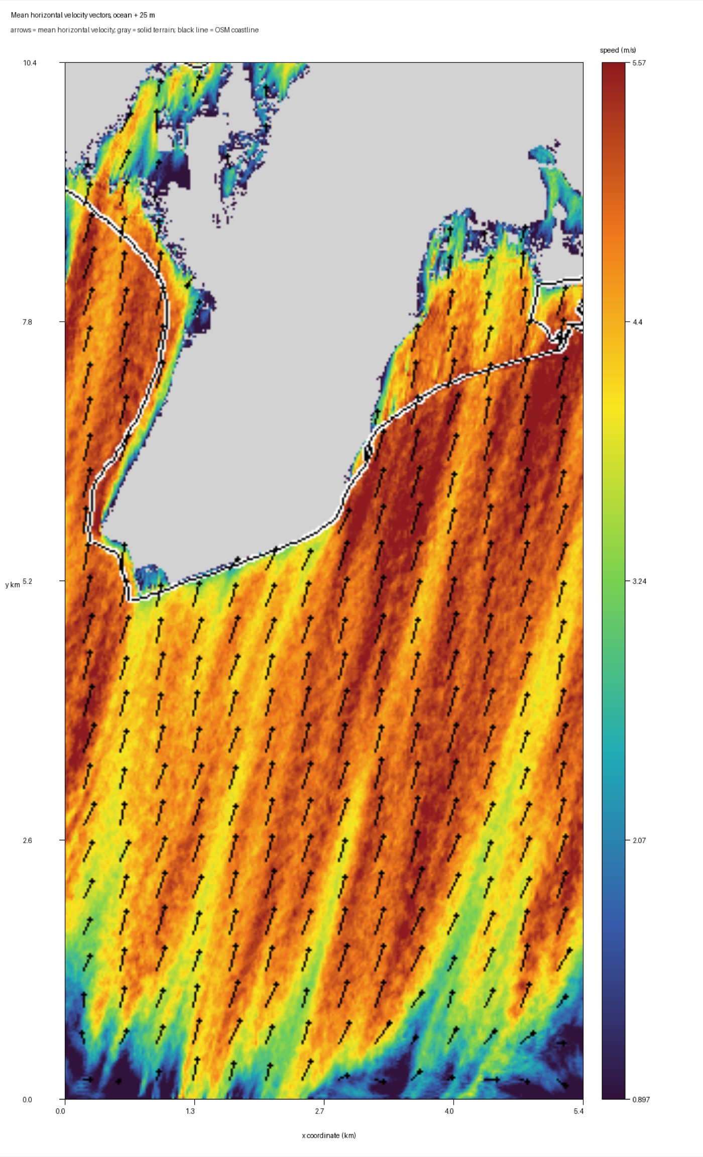
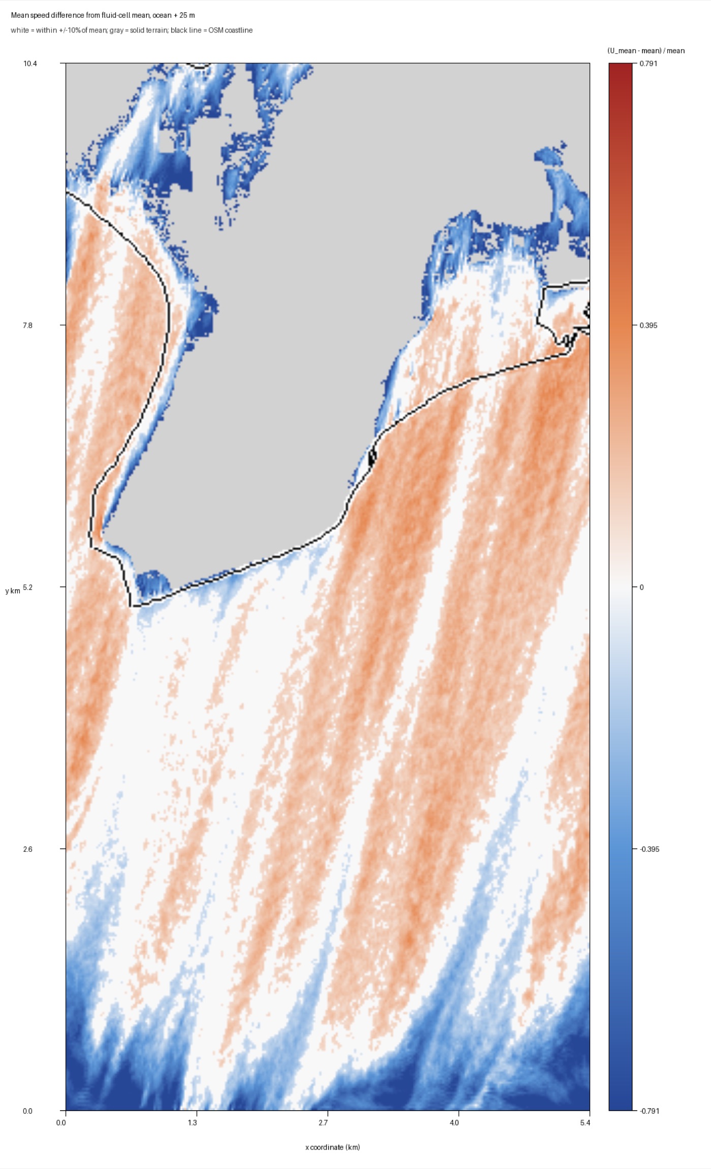
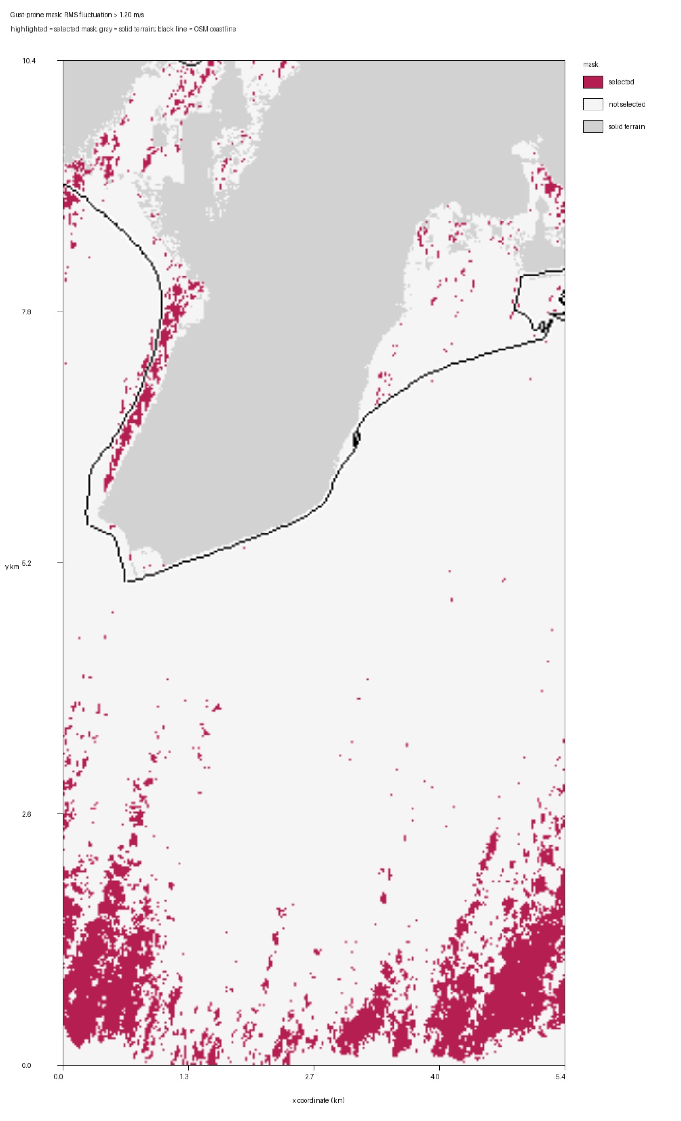
I analyzed a horizontal slice 25 m above the ocean surface — near-surface, but clear of most of the immersed terrain — and overlaid OpenStreetMap shoreline data so the results could be read against the real coastline. Mean horizontal wind speed across the slice was 4.28 m/s, but the flow was not uniform: I defined dead zones as fluid cells running under half the slice’s mean speed, and gust-prone regions as the top 10% of cells by velocity-fluctuation RMS. Dead zones covered 7.3% of the fluid area; gust-prone regions covered 10.0% — and, importantly, they weren’t the same regions. Mean resolved turbulent kinetic energy across the slice was 0.417 m²/s², confirming that a rider can be in a spot with an acceptable average wind speed and still be getting hit by real turbulence-driven variability the mean speed alone wouldn’t predict.
Honest limitations
The kinetic-energy history hadn’t fully leveled off by the end of the run, so I treated the final window of saved snapshots as an approximate quasi-steady state rather than a fully converged one. The first roughly 2 km of the domain showed unstable behavior tied to the periodic boundary condition re-entering flow into itself, so I don’t treat that region as physically meaningful. And I only carried one wind direction through to full convergence — a southwesterly angle based on qualitative experience at the site, not a precisely measured wind record. Testing a spread of southwesterly angles against real wind observations at the site is the most direct way to know whether the simulated dead zones actually line up with the ones riders feel.
All selected work